
Summary
Remembering what matters
Millions of people want to pray consistently, yet remembering what to pray for and returning to those commitments over time is surprisingly difficult.
Existing solutions generally fall into two categories: note-taking apps that aren’t built for recurring habits, and prayer apps centered around guided content rather than personal organization.
Instead of telling users how to pray, we focused on helping them remember what they wanted to pray for through thoughtful organization, lightweight scheduling, and an interface designed to encourage daily use.
This case study focuses on the product design decisions behind creating and shipping a subscription-based iOS application from concept to App Store.
The Problem
Offering structure without prescription
My business partner and I both wanted a better way to organize the people and topics we wanted to pray for.
Paper journals weren’t a good fit for us, and existing productivity apps felt too generic. Reminder apps, notes apps, and task managers all required users to build their own organizational system.
Many prayer apps emphasized guided prayers, meditation content, or prescribed spiritual experiences. Others had outdated interfaces, inconsistent interaction patterns, or organizational models that became difficult to maintain over time.
We believed there was an opportunity to create something much simpler: an opinionated organizational framework that helped people remember what mattered without dictating how they should pray.
Research
Understanding existing habits
Before designing the product, we surveyed potential users to understand how people currently organized prayer requests and where existing approaches broke down.
No reliable system
Prayer requests lived across notebooks, Notes apps, text messages, or memory, often becoming stale or forgotten.

Natural groupings
Most users thought in three categories: individual people, groups of people, and broader topics.
 How to Organize Your Prayer Life + Free Printable Prayer Cardshttps://raisingeverydaydisciples.com/how-to-organize-your-prayer-life-free-printable-prayer-cards/
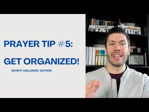 Prayer Tip #5: Get Organized!https://www.youtube.com/watch?v=mQgKZmosL9g
 4 Methods To Organize Your Prayer Lifehttps://www.challies.com/articles/4-methods-to-organize-your-prayer-life/
Organization, not direction
Participants wanted better organization rather than another guided-content platform.
Design Principles
Product principles that guided every decision
Simplicity first
The product should never require users to learn a complicated organizational system.
Daily use over data management
The focus of the app is prayer, not organizing and managing data.
Fast capture
Adding a new prayer should take seconds, even during a conversation.
Build habits without pressure
Avoid making prayer feel like completing a spiritual checklist.
Descriptive, not prescriptive
Provide structure without telling users how they should pray.
Information Architecture
Designing around users’ mental models
Rather than inventing folders, tags, or nested hierarchies, our research suggested a much simpler model.
The information architecture mirrors how users already think instead of forcing them to learn a new organizational system. This dramatically reduces onboarding friction while making future scheduling intuitive.
People
Pray for individuals.
Groups
Pray for groups of people like Family or Friends.
Topics
Pray through themes such as Government or Missions.
Solving Scheduling
Making recurring schedules feel effortless
Scheduling became the most difficult product problem. Traditional calendar interfaces expose enormous flexibility but also significant complexity.
We wanted users to receive the benefits of recurring reminders without feeling like they were creating calendar events. The final solution intentionally constrained the experience.
Most users simply assign people, groups, or topics to one or more days of the week. Power users can create more advanced recurring schedules, but the primary workflow remains fast enough to complete in seconds.
Solving the most common use case created a dramatically better product than supporting every possible edge case.
Visual Design
Designing for an empty state
Unlike social platforms or productivity tools, Praily begins completely empty. Every piece of content is user-generated.
Rather than presenting a sparse interface that emphasized the absence of content, we wanted first launch to feel welcoming and engaging.
Early versions leaned heavily on standard iOS components. As the product matured, we introduced a more opinionated visual language inspired by neo-brutalism.
Large interface elements, generous spacing, bold colors, and expressive shadows help the product feel alive even before users have populated it with content. The experience feels rewarding without relying on streaks, points, badges, or other gamification mechanics.
Onboarding
Teaching the model before asking users to subscribe
Rather than placing the subscription wall immediately after installation, onboarding introduces users to the organizational model first. Users create their first content, experience scheduling, and understand how the system works before beginning a trial. This allows users to experience the core value before making a purchasing decision.
Onboarding
Paywall
Building the Product
From concept to App Store
Praily was a true 0 → 1 product. Working alongside my business partner, I led product strategy, user experience, interaction design, branding, visual design, and much of the application’s front-end implementation.
To accelerate development, we integrated AI into our engineering workflow. AI generated much of the implementation, while I remained responsible for product direction, architecture, interaction design, feature definition, and validating every shipped experience.
Using AI shifted more time toward solving product problems and refining the experience instead of repetitive implementation work.
Outcome
Shipping, learning, and refining
0 → 1 product
Designed and launched a subscription-based iOS application from concept to App Store.
End-to-end ownership
Led product strategy, UX, UI, branding, and implementation.
Live product
Supporting active subscribers with no paid marketing.
Continuous iteration
Currently expanding to Android, shared groups, and church licensing.
Reflection
What I’d do differently
Ship earlier
Launching sooner would have produced better feedback and faster learning.
Ruthlessly simplify
Our earliest versions attempted to solve too many edge cases. Reducing flexibility produced a better experience.
Don’t over-engineer
Building only what users truly need has made the product easier to maintain and extend.
Rather than beginning with features, I focus on understanding user behavior, designing around existing mental models, and creating interfaces that make complex problems feel simple.
From research and information architecture to visual design, engineering, AI-assisted development, and launch, this project reflects the full product design process behind taking an idea from 0 → 1 and continuously improving it through real-world usage.